Indiagators - Creative Agency. Have Patience
Please fill out the form below if you have a plan or project in mind that you'd like to share with us.
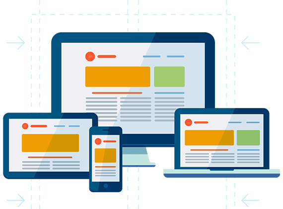
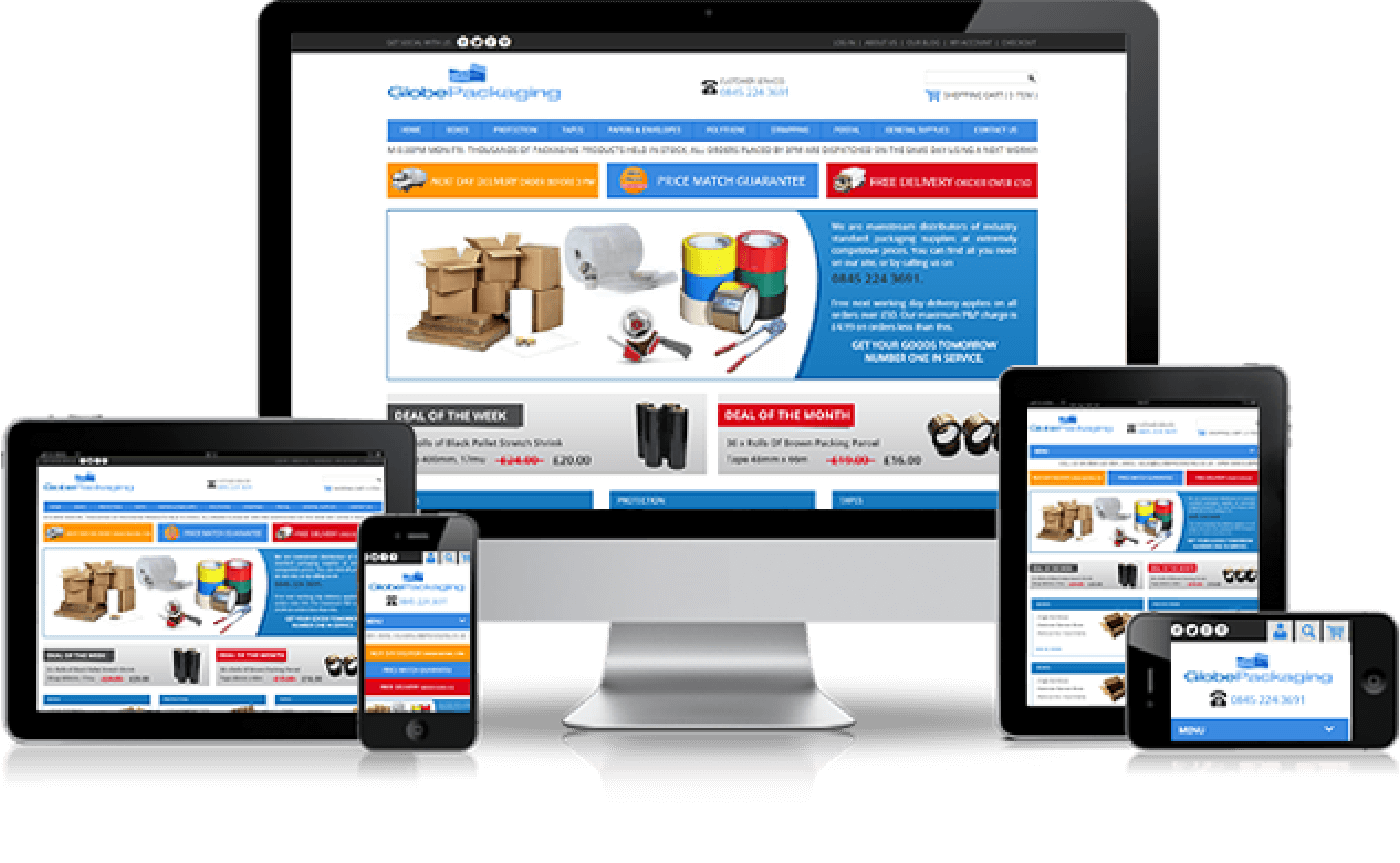
95% of people are switching to multiple screens to browse the internet! So, to target all your potential clients it's important to have a website that is optimized for all devices. Responsive websites have a single URL and HTML code which gets optimized according to the screen resolution on which it is opened thus giving an optimum viewing experience. Past 5years have brought a flood of web enabled devices including smart phones, Kindles, tablets, net books and, the newest addition, phablets.
Responsive website design allows us to build sites that provide an optimal viewing experience across a wide range of devices including mobile phones. It allows easy reading and navigation without the expense of building a customised mobile app.
Our team of specialists will design customized grids, layouts and images ensuring that the image size, resolution and scripting is completely compatible, responsive with each relevant device. Our mission is to ensure that the client has an optimal viewing experience, ensuring the site is easy to read and navigate through across a full range of devices. Our Responsive Website Designs can fit any mobile device screen.
This aspect of our services is catered towards business owners who wish to create cutting-edge, technologically advanced websites that are intriguing, effective and most importantly, compatible with a full range of devices.